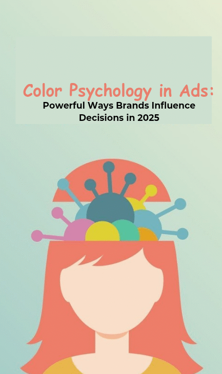
Colors aren’t just decoration in advertising—they’re psychological triggers that decide whether someone scrolls past your ad or clicks through with curiosity.
In 2025, where consumers are bombarded with visuals every second, understanding color psychology in ads has become a secret weapon for brands that want to stand out.
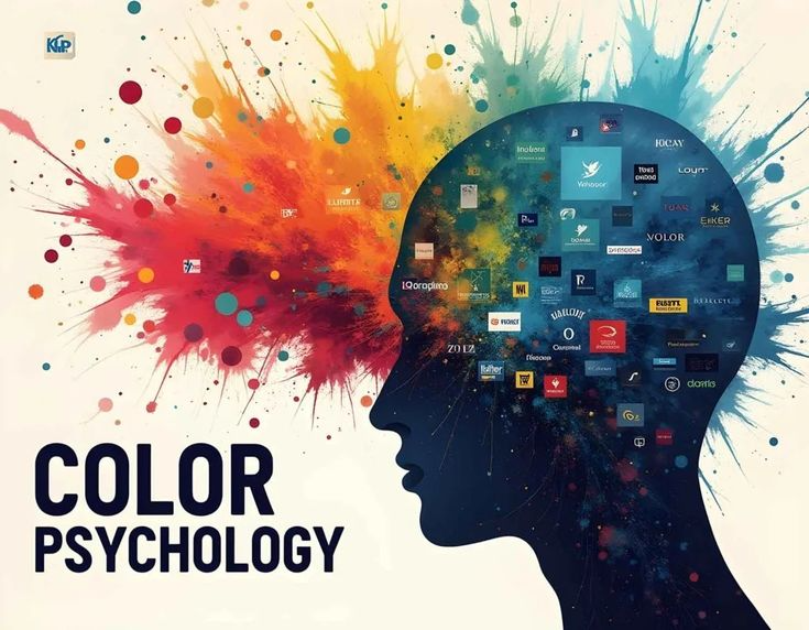
Think of it as decoding the emotions behind every shade: red for urgency, blue for trust, green for balance, black for sophistication.
The right color choice can make your ad feel irresistible; the wrong one can sink it before it even gets noticed.
Marketers who treat colors as strategy—not afterthought—are the ones winning attention, engagement, and conversions.
This isn’t guesswork; it’s backed by years of consumer behavior research, refined by new data-driven design trends.
So, if you’ve ever wondered why some ads feel magnetic while others fall flat, it often comes down to one thing: the powerful psychology of color woven into the creative.
And in this article, we’ll break down the exact strategies and shades that actually work in 2025.
Why Color Still Matters in Advertising Today
Color has always played a significant role in how people perceive brands and products. In 2025, the competitive ad landscape has made the stakes higher than ever.
Consumers are bombarded with visuals across social media, search engines, streaming platforms, and outdoor campaigns.
In such a crowded environment, grabbing attention is not just about catchy copy—it’s about the visual impact of color. This is where color psychology in ads comes into play.
Marketers now understand that color is not a superficial design choice.
Studies consistently show that up to 90% of snap judgments about products can be based on color alone.
That means the hues used in an ad can directly influence whether a consumer feels trust, excitement, urgency, or hesitation.
Colors are also tied to cultural context. While red can signal urgency and passion in one market, it may signify luck and prosperity in another.
This nuance is crucial for global campaigns where misusing color could alienate entire audiences. Advertisers who overlook these layers risk wasted ad spend and missed conversions.
More importantly, neuroscience research shows that color affects not just perception but also behavior.
For instance, ads that use contrasting colors for call-to-action buttons can increase click-through rates by significant margins.
As a result, marketers who master color psychology in ads can steer consumer decisions in subtle yet measurable ways.
The Science Behind Color Perception and Consumer Behavior
Human brains process visuals 60,000 times faster than text, making color one of the first sensory triggers in advertising.
This isn’t just design theory—it’s biology. The cones in our eyes respond differently to wavelengths of light, which translates into how we perceive red, blue, green, and other colors.
This perception directly activates areas of the brain linked to emotion and decision-making.
For advertisers, the implication is clear: the choice of color can prime a viewer before they even read a headline or product description.
A 2024 Psychology & Marketing Journal study found that color-driven emotional responses increase purchase intent by 39%. That’s a margin no brand can afford to ignore.
Take the example of financial services ads. Brands like PayPal and American Express use shades of blue because it conveys trust, security, and professionalism.
Meanwhile, quick-service restaurants often lean on red and yellow to stimulate appetite and create urgency.
These aren’t arbitrary preferences; they’re carefully engineered uses of color psychology in ads to evoke the right feeling at the right moment.
On digital platforms, even small shifts in hue can impact results. A/B testing by HubSpot showed that a red CTA button outperformed a green one by 21% in certain campaigns.
The underlying principle is not that one color is universally better but that color contrast and contextual fit drive effectiveness.
This is why many marketers now treat color as a measurable variable in campaign testing, not just a design flourish.
By integrating color into split-testing workflows, brands can quantify how emotional triggers impact conversions and refine campaigns accordingly.
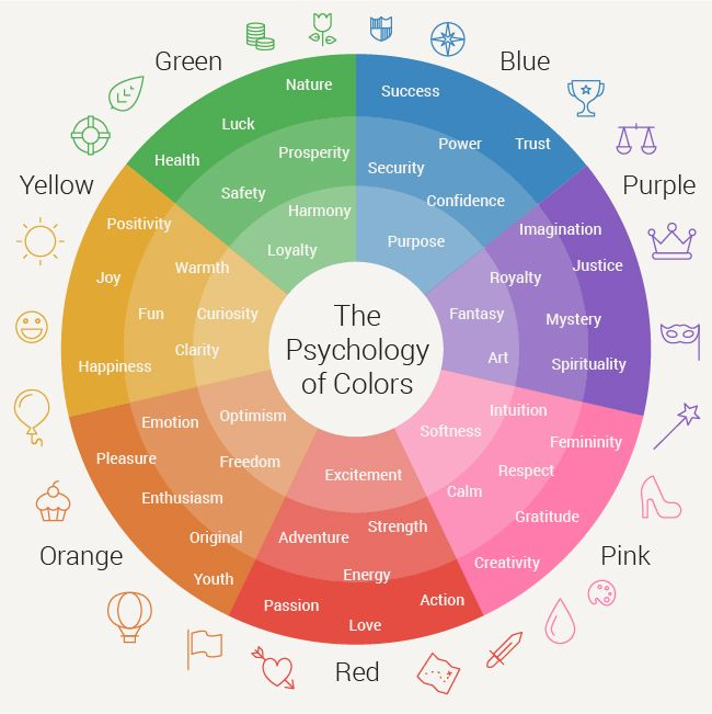
Breaking Down the Emotional Triggers of Major Colors
When analyzing color psychology in ads, marketers need to move beyond vague associations and examine specific emotional triggers.
Each color carries a distinct set of psychological effects that can be leveraged depending on the product, audience, and campaign objective.
#1. Red – Often used to create urgency, stimulate appetite, and convey passion. Retailers use it in clearance ads because it heightens excitement and compels action.
#2. Blue – Associated with trust, reliability, and calmness. It dominates industries like tech, finance, and healthcare where security and dependability are key.
#3. Green – Linked to health, wellness, and sustainability. Perfect for eco-friendly campaigns or products tied to natural living.
#4. Yellow – Conveys optimism, cheer, and youthfulness. It captures attention quickly but must be balanced to avoid overstimulation.
#5. Black – Used to communicate luxury, exclusivity, and sophistication. Common in premium fashion and high-end product ads.
#6. Purple – Often tied to creativity, imagination, and spirituality. It works well for beauty and wellness brands.
#7. Orange – Combines energy and affordability. Frequently used in call-to-actions because it feels approachable yet urgent.
While these associations are widely recognized, effective campaigns rely on context and target demographics.
For example, in Western markets, white suggests purity and minimalism, but in some Asian cultures, it is linked with mourning.
A misstep here can dilute brand messaging or even create negative associations.
Understanding these nuances ensures that color psychology in ads doesn’t just make campaigns visually appealing but also culturally relevant and emotionally persuasive.
The Role of Color Consistency in Brand Identity
One overlooked aspect of color psychology in ads is consistency. Consumers form attachments to brand colors because repeated exposure builds recognition and trust.
Think of Coca-Cola’s red, McDonald’s yellow arches, or Tiffany’s iconic blue box. These brands don’t just use color—they own it.
A University of Loyola study revealed that consistent use of signature brand colors increases brand recognition by up to 80%. In a world where consumers scroll past hundreds of ads daily, that edge is crucial.
Inconsistent color use, on the other hand, can weaken brand equity. If a fintech startup runs ads with conflicting color schemes across platforms, consumers may subconsciously perceive it as less trustworthy.
Consistency is particularly important for programmatic ads, where variations must still align with the overarching color strategy.
Consistency also applies across ad formats. The colors used in display ads should match those in social campaigns, landing pages, and packaging.
This holistic approach reinforces the psychological association between the brand and its promise.
For example, Spotify consistently uses green across banners, playlists, and premium ads, reinforcing its identity in the audio streaming space.
For brands scaling globally, creating a style guide that defines exact HEX, RGB, and CMYK codes ensures that color psychology in ads remains cohesive regardless of medium or market.
Over time, this consistency builds both visual equity and consumer trust.
How Color Psychology Influences Digital Ad Performance
Digital advertising has made measuring the impact of color far more precise. With the rise of AI-driven platforms and A/B testing tools, brands can now track how small changes in hue affect click-through rates, conversions, and cost per acquisition.
On platforms like Meta Ads Manager or Google Ads, advertisers can run split tests with different color schemes for display and video campaigns.
For example, swapping a neutral-themed banner for one with a bold red headline can reveal whether urgency outperforms subtlety for a given audience segment.
Data from Canva’s 2024 marketing trends report shows that ads using vibrant, high-contrast colors saw engagement rates increase by 18% compared to muted palettes.
However, effectiveness also depends on ad fatigue—what works once may lose impact if overused.
Mobile-first design has also made color more critical. Since over 70% of ad impressions now occur on mobile devices, advertisers must ensure colors are optimized for smaller screens.
Bold hues and clear contrasts are essential for readability and engagement on mobile.
In e-commerce, color also impacts perceived value.
Research published in the Journal of Business Research found that product images with warm color schemes can increase perceived value by 12%, influencing not only clicks but final purchase decisions.
This makes color psychology in ads a revenue-driving factor, not just a creative choice.
Adapting Color Psychology to Global Markets
The global nature of advertising in 2025 requires brands to be culturally sensitive with color choices.
A campaign that resonates in North America might backfire in Asia or Africa if cultural meanings are overlooked.
For example, while purple is often associated with luxury in Western markets, it can symbolize mourning in parts of Latin America.
Similarly, green may represent growth and prosperity in the Middle East but is heavily politicized in other regions.
Multinational brands invest in cultural research and local testing to ensure their use of color psychology in ads is contextually appropriate.
Nike, for instance, adapts its palette for local campaigns without diluting its global identity. The swoosh remains consistent, but surrounding colors shift to reflect local culture and sentiment.
This adaptability has measurable benefits. A McKinsey report highlighted that localized ad creatives drive 1.7 times higher engagement than generic global templates.
Color alignment is one of the most powerful factors in achieving this localization.
For advertisers managing multiple markets, building modular creative templates allows for flexible color adjustments while maintaining brand consistency.
This ensures global scalability without sacrificing cultural sensitivity.
Color Testing and Data-Driven Campaign Optimization
Modern advertising no longer relies on guesswork when it comes to color. Tools like heatmaps, eye-tracking studies, and split-testing platforms provide data on how different palettes affect user engagement.
Eye-tracking technology, for instance, shows where viewers’ attention lingers most in an ad. Bright colors often draw initial attention, while contrasting shades guide the eye toward CTAs.
Brands can then refine designs to ensure the most important elements—like pricing, offers, or buttons—are emphasized.
Programmatic platforms also allow for multivariate testing of color schemes.
Instead of testing one color at a time, advertisers can analyze how different combinations of text, background, and button colors perform together.
This approach has been shown to improve ad ROI by as much as 23%.
Importantly, optimization should never stop at the first successful test. Consumer responses to color can change with seasonality, trends, and platform norms.
For instance, pastel tones may perform better during spring campaigns, while darker, muted tones may resonate in winter.
Brands that continuously test and adapt their use of color psychology in ads maintain an edge in performance and relevance.
In 2025, mastering color psychology in ads is no longer optional—it’s essential for driving measurable results.
From emotional triggers and cultural nuances to digital testing and brand consistency, every element of color usage influences how consumers perceive and respond to advertising.
Brands that treat color as a strategic lever, not just a design choice, stand to increase engagement, improve conversions, and strengthen long-term equity.
As advertising grows more competitive and data-driven, the ability to align creative psychology with measurable outcomes will define the next generation of marketing leaders.
Conclusion
In 2025, mastering color psychology in ads is no longer optional—it’s essential for driving measurable results.
From emotional triggers and cultural nuances to digital testing and brand consistency, every element of color usage influences how consumers perceive and respond to advertising.
Brands that treat color as a strategic lever, not just a design choice, stand to increase engagement, improve conversions, and strengthen long-term equity.
As advertising grows more competitive and data-driven, the ability to align creative psychology with measurable outcomes will define the next generation of marketing leaders.