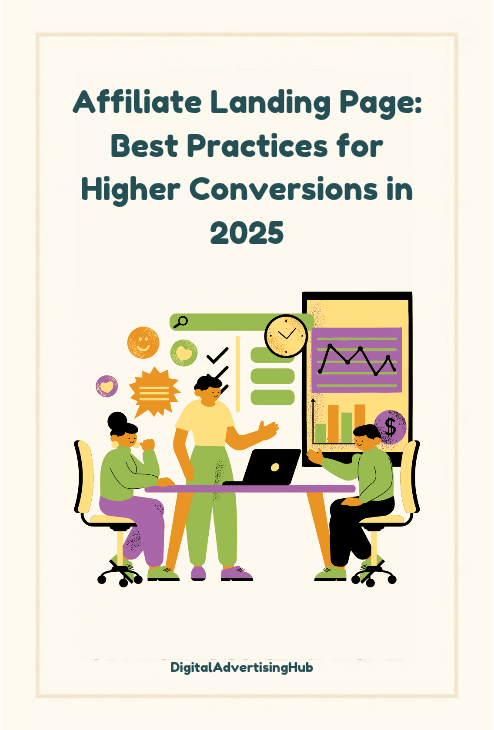
An effective affiliate landing page does one job: convert a specific type of visitor into a specific action.
That action might be an email signup, a free trial, or a purchase through your unique link. The path to that outcome is not guesswork.
It is clarity about who you are targeting, the problem they want solved, and the steps that move them from curiosity to commitment.
In 2025, attention is limited and expectations are higher, so your page needs to load fast, speak plainly, and remove friction.
When you design an affiliate landing page around intent, the experience becomes easy to understand and easy to act on. You reduce cognitive load, highlight value, and reinforce trust.
This guide focuses on the practical elements you can control today: audience research, offer structure, the fold, messaging, credibility, UX, forms, analytics, testing, and long-term maintenance.
If you already have traffic, these principles help you convert more of it. If you are still building traffic, they ensure the visitors you do earn find a focused, relevant affiliate landing page that rewards their click rather than wasting it.
#1. Audience and Intent Research

Conversion problems usually come from mismatched expectations. You promise one thing in an ad or review and deliver something different on the page.
Start by mapping search and channel intent. What questions or pains bring people to you? What stage are they in—awareness, comparison, or purchase?
Build short profiles from real inputs: search queries you rank for, comments on your content, email replies, and support tickets of the product you promote if you can access them.
Use this inventory to draft a hierarchy of information: headline that names the outcome, subhead that qualifies the audience, bullets that address objections, and a clear call to action.
The more specific your research, the more precise your copy and offer. This matters for any affiliate landing page aimed at competitive niches like hosting, VPNs, or software.
It also guides your angle: performance, savings, simplicity, or safety. Capture exact phrases people use and reflect them back on the page.
By aligning your pre-click promise with the post-click experience, you raise your baseline conversion rate before testing begins and set the foundation for a resilient affiliate landing page that grows with your traffic.
#2. Offer and Value Proposition
A landing page converts when the offer is obvious and relevant.
Decide the primary action: claim a discount, start a free trial, or download a comparison guide that includes your affiliate link.
Structure the value proposition into three parts: the result the user wants, how quickly they get it, and what makes your route safer or cheaper.
Avoid generic claims. Tie benefits to a concrete outcome such as faster setup, lower monthly cost, or a risk-free trial.
If you can add a bonus that only exists through your link—an onboarding checklist, email templates, or a setup call—that increases perceived value without changing the merchant’s pricing.
Place your strongest proof next to the offer: a short case example, a before/after metric you are allowed to share, or verified user feedback from your audience.
Keep the language direct and measurable. The goal is to make the trade clear: time or money saved in exchange for a click, trial, or purchase.
When your offer is grounded like this, the rest of the affiliate landing page can be simpler. You won’t need long explanations because the benefit is clear at a glance, and visitors can act without hunting for details.
#3. Optimize Your Structure
The first screen decides whether people stay.
Keep it uncluttered and specific. Use a headline that states the outcome, a supporting line that names who it is for, a short list of two to four value points, and one primary button.
If you include a hero image, ensure it reinforces the offer—interface, result preview, or a clear visual of what they receive.
Do not stack multiple competing buttons. One action is enough. If legal or disclosure text is required for affiliate content in your region, add a concise notice near the call to action so visitors understand the relationship.
Navigation should be minimal or removed to prevent leaks. For mobile, prioritize legible font sizes, touch-friendly buttons, and spacing that prevents accidental taps.
Place a secondary anchor link below the fold to scroll to details for users who need more information.
This pattern lets decisive visitors act quickly while giving others an easy path to explore. Treat this fold as a snapshot of the entire affiliate landing page.
When someone takes a quick glance, they should know the benefit, the qualifier, and exactly what to do next without confusion or extra steps that slow them down.
#4. Always Use Clear Messaging
Clear writing converts better than clever wording. Start with the objection list you gathered from research.
Turn each objection into a concise statement and an answer placed where it matters. If price is sensitive, present total cost and any available discounts with the effective monthly figure and what is included.
If complexity is a barrier, highlight time to first value and support options. Use short paragraphs, descriptive subheads, and bullets where helpful, but keep the page focused on one action.
Avoid vague adjectives and replace them with specifics: numbers, features tied to outcomes, and conditions of the offer.
Every sentence should either explain value, reduce risk, or prompt action. Reuse key phrases the audience searches for, but keep density natural.
The best performing affiliate landing page copy speaks like a helpful salesperson who knows the product and respects the reader’s time.
Mirror the decision sequence: outcome, proof, details, and action. If you are comparing plans, show the default that fits most visitors and explain who should choose alternatives.
The more direct the language, the less room there is for hesitation, and the higher the chance that visitors complete the intended step.
#5. Gain Trust and Credibility with Social Proof
Trust elements work when they are specific and verifiable. Generic badges and vague testimonials add length without impact.
Use proof that matches your claim: screenshots of real dashboards with sensitive data redacted, verified reviews your audience will recognize, or a concise note about your experience using the product.
If you received a unique benefit for the review, disclose it clearly. Place proof near related claims, not in a distant block.
If you include ratings, ensure they reflect the source fairly and are permitted by that source. For time-sensitive promotions, show the real deadline and explain what changes after it.

If the offer includes a guarantee from the merchant, summarize the terms in plain language and link to official details on the final step.
The more transparent you are, the less resistance you face. Many visitors have seen manipulative tactics and are guarded.
A straightforward affiliate landing page that avoids hype and backs claims with real evidence will convert better over time and keep your reputation intact.
This also reduces refund-related churn downstream, which preserves commissions and strengthens your relationship with the programs you promote.
#6. Prioritize Design, UX, and Performance
Design is a conversion lever when it improves comprehension. Use a simple color system: one brand color for action, a neutral for backgrounds, and dark text for readability. Keep contrast high.
Limit typefaces to one or two and use consistent sizing to signal hierarchy. Make buttons large enough for thumbs and keep primary actions visually distinct from secondary links.
Performance matters because slow pages lose visitors. Compress images, lazy-load noncritical assets, and serve modern formats where supported.
Prioritize the content needed for the first interaction. This is especially important for an affiliate landing page that receives paid traffic, where each second of delay reduces return on spend.
Test accessibility basics: keyboard navigation, alt text on meaningful images, and labels on form fields.
Good UX also means predictable behavior; avoid elements that move as the page loads. Keep modals rare and purposeful. If you use chat widgets or pop-ups, ensure they do not block the main action on mobile.
Aim for a page that feels quiet and easy to process. When visual noise is low and performance is strong, visitors can evaluate the offer quickly and move forward without friction.
#7. Forms, Friction Reduction, and Safe Data Handling
If your conversion is a lead capture, forms are where many sessions fail. Ask only for what you need to deliver value.
Name and email often suffice. Explain why you need each field and how you will use the information. Provide immediate validation so users can correct errors as they type.
Use clear error messages that show what went wrong and how to fix it. If you request phone numbers or payment details for a trial, state the exact terms, renewal timing, and cancellation steps in plain language.
Add a short privacy summary next to the form and link to the full policy. People decide based on clarity and perceived risk.
Reduce friction by supporting passkeys or passwordless options if account creation is necessary with the merchant.
On an affiliate landing page that routes to a partner form, preview what comes next so visitors are not surprised by additional steps.
If you offer a bonus for signing up through your link, remind users how they will claim it and set expectations for delivery.
Transparent process lowers anxiety, and fewer fields shorten time to completion. Both improvements raise conversion without changing traffic or creative.
#8. Analytics, Tracking, and Testing
Decisions need reliable data. Set up unique URLs or parameters for every source that sends visitors to your page.
Track the primary action with a simple event and verify that it fires only when the action is complete.
If you offer email capture, verify that your autoresponder delivers the promised asset and that clicks from those emails use your affiliate link.
Use a single source of truth for conversion reporting to avoid confusion when numbers differ between tools.
Test changes in a controlled way. Start with high-impact elements: headline, offer framing, button copy, and first-screen layout.
Change one major element at a time and give the test enough traffic to reach a stable result. Document each test with the hypothesis and outcome so you do not repeat ideas that failed.
This discipline matters because small tweaks near the fold can out-perform big redesigns.
An affiliate landing page improves when you keep what works, remove what does not, and avoid random changes.
Over time, you build a library of patterns tuned to your audience and niche. That library becomes a durable advantage that compounds with every campaign you run.

#9. Ensure Traffic Alignment, Pre-Sell Flow, and Message Match
The best page cannot fix the wrong traffic. Match your acquisition method to the promise on the page.
If your ad mentions a specific discount, show it at the top. If your review highlights a feature, lead with that value on the landing screen.
Consider a short pre-sell article for colder audiences that need context before committing. Keep the path linear: ad or article, affiliate landing page, partner checkout.
Remove detours that send people into unrelated content. For search traffic, optimize the snippet to match your headline and meta description so users who land already expect your angle.
For email, segment by interest and send visitors to a tailored version rather than a generic page. Message match increases perceived relevance, which directly raises conversion.
This is where many affiliate landing page builds see quick gains: align the words and visuals people saw before the click with what they see after the click.
When both sides of the click agree, visitors feel confident they are in the right place and continue without second-guessing.
Keep this alignment tight across seasons and promotions so your page remains consistent with your outreach.
#10. Localization, Disclosures, and Program Compliance
Compliance protects your business and keeps your partnerships active. Include a concise disclosure that states you may earn a commission if someone purchases through your links.
Place it near the call to action or in the footer where it is easy to see. Use plain language. Localize currency, spelling, and examples to the regions you target so the offer feels relevant.
If you promote in multiple markets, consider geo-specific pages with accurate pricing and availability notes.
Keep screenshots and claim details up to date. If the merchant changes plan names or pricing, update your copy promptly.
Program terms often specify how you can represent offers, use logos, or bid on brand terms. Follow those rules to avoid reversed commissions or dismissal from the program.
A compliant and localized affiliate landing page does more than avoid penalties; it signals professionalism to visitors.
They are more likely to trust a page that respects regional norms, uses clear disclosures, and presents accurate information.
This trust translates into higher completion rates and fewer post-purchase disputes that can otherwise reduce your earnings.
Common Mistakes to Avoid
High-converting pages are maintained, not set and forgotten. Create a monthly checklist: verify links, confirm discounts, test forms, and review email delivery.
Scan your analytics for sudden shifts in device mix or source quality that might explain conversion changes.
Refresh screenshots and copy to reflect product updates. Retire elements that add length without aiding decisions.
Common mistakes are scope creep, where a single page tries to target multiple audiences; excessive navigation that leaks traffic; and inconsistent calls to action that confuse people.
Another frequent problem is burying the main benefit below long introductions. Start strong, then explain.
Finally, keep a change log. When you update the affiliate landing page, record the date, what changed, and why.
This record helps you correlate performance with edits and prevents you from undoing previous gains.
A simple maintenance habit preserves the improvements you worked to earn and keeps the page aligned with the product, program rules, and audience expectations.
The result is a steady increase in conversions driven by clear structure, honest messaging, and fast, predictable experiences that respect the visitor’s time.
Conclusion
A reliable landing page is the product of clear decisions rather than trends. Define the target user and the one action you want.
Build the offer around a concrete outcome. Keep the first screen focused. Write plainly. Prove claims with specific evidence. Make the page fast and accessible.
Ask for only the data you need. Track conversions with simple, verifiable events and test changes methodically. Align your traffic promises with on-page messages.
Stay compliant and localize where it matters. Maintain the page with a regular checklist. If you apply these principles, your affiliate landing page will convert more of the visitors you already reach and will be easier to scale with new campaigns.
Start by auditing your current page against the sections in this guide. Pick the two weakest areas, make targeted improvements, and measure the results over the next thirty days.
Repeat the cycle. Each iteration compounds your gains and keeps your page relevant, trustworthy, and effective throughout 2025.