If you’re a blogger, you know how important it is to create engaging and valuable content for your audience. You know how to write captivating headlines, compelling introductions, and informative body paragraphs.
But do you know how to create and optimize CTA buttons for your blog?
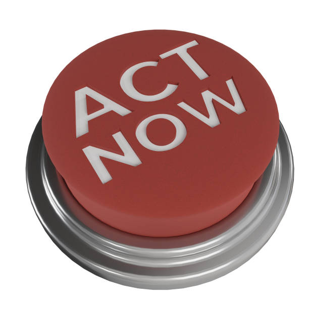
A CTA button, or a call-to-action button, is a link or button that tells your visitors what you want them to do next. It could be to subscribe to your newsletter, download your ebook, join your course, or buy your product.
A CTA button is the most important element of your blog, because it connects your content with your conversion goal. Without a CTA button, your visitors might not know what to do after reading your blog post, and they might leave without taking any action.
But creating and optimizing CTA buttons for your blog is not as easy as it sounds. Many factors can influence the performance of your CTA buttons, such as shape, size, color, style, text, position, and optimization.
That’s why we’ve created this CTA button design 101 course for you.
In this course, you’ll learn everything you need to know to create and optimize CTA buttons for your blog and skyrocket your conversions.
You’ll learn:
#1. How to choose the right shape, size, color, and style for your CTA button
#2. How to write clear, compelling, and action-oriented text for your CTA button
#3. How to position your CTA button for optimal visibility and accessibility
#4. How to test and optimize your CTA button for maximum conversions
This course is designed for beginners who want to learn the basics of CTA button design for blogging. You don’t need any design or coding skills to take this course. You just need to have a blog and a desire to improve your conversions.
Are you ready to take your blog to the next level? Enrol in this course today and start creating CTA buttons that convert.
How do you choose the right shape, size, color, and style for your CTA button?

In this section we are taking you on a tour to learn how to choose the right shape, size, color, and style for your CTA button.
#1. The shape of your CTA button should be Affordant
By the shape of your CTA button to be accordable, this means that it should look like a button that can be clicked.
Some common shapes are rectangles, circles, or rounded corners. Avoid using shapes that are too complex or irregular, as they might confuse the users or distract them from the main action.
#2. Make the CTA Button Large Enough
The size of your CTA button should be large enough to stand out from the rest of the page elements, but not too large that it overwhelms the design or the message. A good rule of thumb is to make your CTA button at least 44 pixels in height and width, as this is the minimum size for a finger-friendly touch target.
#3. Make the CTA Button Color to contrast with the background
The color of your CTA button should contrast with the background color, so that it draws the user’s attention and creates a sense of urgency. You can use a color wheel to find complementary or analogous colors that work well with your brand’s color scheme. Avoid using colors that are too dull, dark, or similar to the background, as they might make your CTA button less noticeable or appealing.
#4. The CTA button should be consistent with your brand’s identity
The style of your CTA button should be consistent with your brand’s identity and tone of voice, as well as the overall design of your website. You can use fonts, icons, borders, shadows, gradients, or animations to add some personality and flair to your CTA button, but make sure they are not too distracting or cluttered. You can also use white space, alignment, and proximity to create a clear visual hierarchy and balance.
How do you write clear, compelling, and action-oriented text for your CTA button?
Below is how to write clear, compelling, and action-oriented text for your CTA button:
#1. Make the text of your CTA button clear
The text of your CTA button should be clear, meaning that it should communicate the value proposition and the desired outcome of the action simply and concisely. You can use verbs, nouns, adjectives, or numbers to convey the benefits and urgency of your offer, but avoid using jargon, slang, or vague terms that might confuse the users or reduce their trust.
#2. Make the CTA Button compelling
The text of your CTA button should be compelling; this means that it should persuade the users to take action by appealing to their emotions, needs, or pain points. You can use power words, questions, testimonials, or social proof to create a sense of curiosity, excitement, fear, or scarcity, but avoid using hyperbole, false promises, or manipulation that might backfire or damage your reputation.
#3. Make the text of your CTA button action-oriented
The text of your CTA button should be action-oriented, meaning that it should start with a strong verb that describes the action the users need to take, such as “Buy”, “Download”, “Sign up”, or “Learn more”. You can also use modifiers, such as “Now”, “Today”, or “Free”, to add some urgency or incentive to your CTA button, but avoid using passive voice, negative words, or too many words that might weaken your CTA button or make it less readable.
How do you position your CTA button for optimal visibility and accessibility?
Here is how to position your CTA button for optimal visibility and accessibility:
#1. Prominently position your CTA button to be visible
The position of your CTA button should be visible, meaning that it should be placed in a prominent and logical location on your web page, where the users can easily see and reach it. You can use the F-pattern or the Z-pattern to determine the optimal placement of your CTA button, depending on the layout and the content of your web page. Avoid placing your CTA button below the fold, in the corners, or near other competing elements, as they might reduce the visibility or the click-through rate of your CTA button.
#2. Place your CTA button in an accessible position
The position of your CTA button should be accessible, meaning that it should be designed and coded in a way that allows all users, regardless of their abilities or devices, to interact with it. You can use web accessibility guidelines, such as WCAG 2.1, to ensure that your CTA button meets the standards of perceivability, understandability, and robustness. You can also use tools, such as Lighthouse or WebAIM, to test and improve the accessibility of your CTA button .
How do you test and optimize your CTA button for maximum conversions?
Here let’s dive into how to text and optimize your CTA button for maximum conversions:
#1. Make the text of your CTA button data-driven
The test of your CTA button should be data-driven, meaning that it should be based on quantitative and qualitative data that you collect and analyze from your users and your website. You can use tools, such as Google Analytics, Hotjar, or Crazy Egg, to measure and track the performance and the behavior of your CTA button, such as the click-through rate, bounce rate, conversion rate, or the heat maps .
#2. Optimize your CTA button with iterative testing
The optimization of your CTA button should be iterative, meaning that it should be done continuously and systematically, using methods, such as A/B testing, multivariate testing, or split testing, to compare and evaluate different versions of your CTA button and find the best one for your website and your audience. You can also use tools, such as Optimizely, VWO, or Unbounce, to create and manage your tests. These tools provide a user-friendly interface to create and manage tests, track results, and analyze data. They also offer a range of features, such as heat maps, click maps, and session recordings, to help you gain insights into user behavior and identify areas for improvement.
Conclusion
In conclusion, the CTA Button Design 101 provides you with every detailed guides you need to follow towards creating and optimizing CTA buttons for your blog and skyrocketing your conversions as a blogger. We have exposed you to the importance of creating an engaging and valuable content for your audience. With this guides, you’ll be able to know how to write captivating headlines, compelling introductions, and informative body paragraphs as well as design outstanding CTA button that attract conversions.