
Digital advertising has become more competitive, more automated, and more expensive—but ad banners still play a critical role in how brands capture attention, shape perception, and drive measurable action across the web.
From high-traffic media sites to niche blogs and mobile apps, banner ads remain one of the most widely used formats for reaching audiences at scale.
The difference in 2026 is that visibility alone is no longer enough. Performance now depends on precision: the right format, the right size, the right design, and the right placement working together.
As users scroll faster and platforms optimize harder, poorly designed banners are ignored instantly.
High-impact ad banners, on the other hand, still influence clicks, brand recall, and conversions when they are built with intent.
This means understanding which banner types perform best, how design choices affect engagement, and why certain sizes dominate modern display networks.
It also means learning from real examples, not theory—seeing how effective banners structure messaging, visuals, and calls to action without overwhelming the viewer.
In 2026, banner advertising is less about decoration and more about function.
Brands that treat ad banners as strategic assets—not afterthoughts—are the ones that continue to extract value from display advertising in an increasingly crowded digital environment.
Understanding the Types of Ad Banners
Successful campaigns begin with knowing what kinds of ad banners exist and why each type matters.
In display advertising, there are several standard formats commonly used by advertisers because they deliver impressions efficiently and fit naturally into premium publisher zones.
The Interactive Advertising Bureau (IAB) defines a core set of display formats that are widely accepted across networks like Google Display and programmatic platforms.
These include:
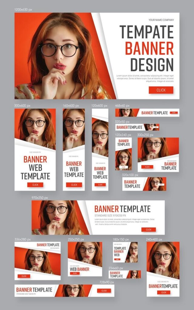
#1. Leaderboard banners: Horizontal ads typically sized at 728×90 pixels, ideal for top-of-page placements that reinforce brand messages or promotional offers.
#2. Medium rectangle banners: At 300×250 pixels, this versatile format performs well within content or sidebar placements, making it one of the most used ad banners globally.
#3. Large rectangle banners: Slightly larger at 336×280 pixels, these offer more creative space while maintaining compatibility with most placements.
#4. Wide skyscraper and skyscraper banners: Vertical formats like 160×600 or 120×600 pixels that work well on sidebar placements.
#5. Mobile banners: Optimized for smaller screens, banner sizes such as 320×50 and 320×100 pixels ensure visibility without compromising mobile experience.
#6. Billboards, half-page, and portrait units: Larger formats like 970×250 (billboard), 300×600 (half-page), and 300×1050 (portrait) offer high impact and visibility in premium inventory.
Each type of ad banner serves a purpose: leaders capture broad visibility, rectangular forms balance visuals and copy, and mobile banners optimize for touch interactions.
Choosing the right type depends on campaign goals, target audience behavior, and placement opportunities across desktop and mobile inventory.
Best Ad Banners: What Works in 2026
Not all ad banners are created equal. Over the years, data has shown that certain sizes consistently outperform others in terms of viewability and click-through rate (CTR), making them “best” options for most campaigns.
In terms of performance, the medium rectangle (300×250) stands out because of its adaptability across screen types and its integration within editorial content, where users are already engaged.
According to industry measurements, this size accounts for a significant proportion of impressions across the Google Display Network and beyond.
For desktop environments, leaderboard banners (728×90) and wide skyscraper banners (160×600) reliably deliver visibility because they occupy premium real estate above or beside primary content.
Larger units like billboards (970×250) and half-page banners (300×600) generate strong attention and provide ample space for messaging and creative assets.
On mobile, large mobile banners (320×100) often yield higher engagement than smaller formats because they balance visibility with user experience, avoiding the pitfalls of overly intrusive ads.
When combined into a comprehensive strategy that uses multiple sizes simultaneously (often referred to as a multi-format pack), these best ad banners ensure coverage across placements and screens, increasing the likelihood of reaching audiences wherever they browse.
Real Ad Banner Examples to Learn From
Concrete examples of high-impact ad banners help bridge the gap between theory and execution.
In 2026, some of the most effective banner creatives share several common characteristics: clear messaging, strong calls to action, balanced layout, and brand consistency.
Take for example a travel brand’s web banner ads that use vibrant destination imagery, minimal text, and a single, unmistakable call to action like “Book Now & Save.”
These banners perform well because they communicate the offer immediately without overwhelming the viewer.
Another example comes from software companies using medium rectangle banners that embed a short supporting headline (“Boost Productivity”), a concise value statement (“Get More Done in Less Time”), and a contrasting CTA button (“Start Free Trial”).
The simplicity of this layout helps reduce cognitive load and encourages action.
In e-commerce, banners sized at 300×600 can showcase multiple products while emphasizing special offers.
For instance, an electronics brand might display top product images on one side, a bold discount headline on the other, and a CTA that reads “Shop Deals.”
By structuring content hierarchically, these banners guide the viewer’s eye effectively from visuals to action.
These examples show how effective creative doesn’t rely on complexity — it relies on relevance, clarity, and alignment with user intent.
Ad Banner Ideas That Drive Engagement
Creative ideas for banner ads can mean the difference between a campaign that stagnates and one that scales.
As you plan your ad banners for 2026, consider concepts that align with audience behaviors and media context:
#1. Seasonal promotions with countdowns: Time-sensitive offers such as holiday sales, product launches, or limited-time discounts create a sense of urgency within banner ads. Use bold typography and visual cues like clocks or progress bars to highlight scarcity.
#2. Dynamic product showcases: Rotate featured items within a single banner unit using subtle animation (HTML5 format) to draw attention without distracting. This keeps the ad fresh and can increase interaction.
#3. Social proof integration: Include brief testimonials or ratings within banner creatives. A simple star rating next to a product image can reinforce trust and push users toward click-through.
#4. Interactive elements: While still lightweight, adding interactive elements like hover states or mini-expansions (in HTML5) can improve engagement by rewarding user interaction.
#5. Localization and personalization: Use data signals to tailor banner content based on user location or behavior. Personalized headlines and offers often perform better because they feel directly relevant.
These concepts are grounded in the understanding that ad banners aren’t just visual elements — they are functional touchpoints meant to complete a journey, whether that’s brand recall, lead generation, or direct conversion.
Designing Ad Banners That Convert
A banner’s design dictates its effectiveness just as much as its placement. Beyond the basics of size, a high-impact design must consider layout, typography, imagery, the best color contrast, and calls to action.
A core principle of effective banner design is visual clarity. Ads with cluttered layouts or too many competing elements tend to underperform because viewers cannot quickly parse the message.
Instead, prioritize a hierarchy: strong headline, relevant visual, concise subcopy, and a distinct CTA.
Call to action (CTA) buttons deserve special attention. A clear CTA such as “Get Offer,” “Learn More,” or “Sign Up Free” should contrast visually with the background and sit in a predictable zone where users expect to find it.
Research consistently shows that clear CTAs improve CTR.
High-quality visuals are essential. Blurry or low-resolution images reduce perceived professionalism and credibility.
Use images that align with your brand identity and the campaign message while ensuring they are optimized for fast loading.
Brand consistency — applying your logo, color palette, and typography consistently across all ad banners — builds recognition, especially when users encounter your ads multiple times across the web.
Finally, typography must be readable at first glance. Use sans-serif or clear serif fonts with sufficient contrast against the background. Avoid small script fonts that are difficult to read quickly.
Website Banner Ads Examples to Inspire Your Next Campaign
When studying web banner ads that perform well, you’ll notice certain patterns in layout and messaging.
For example, retail brands often use banners that balance imagery and copy by placing the product shot on the left with text and CTAs on the right, guiding the eye naturally from discovery to action.
Service brands (like SaaS platforms) often use medium rectangle banners embedded within content pages.
These banners display concise statements such as “Boost Your Team’s Productivity in Minutes” alongside a visually distinct button like “Start Free Trial,” driving conversions without overwhelming the reader.
Ad campaigns for events frequently leverage skyline placements like leaderboard banners at the top of publisher sites to announce dates and early-bird pricing, maximizing visibility during key traffic periods.
Across these examples, the unifying strategy is relevance: matching the creative and message to the audience’s context and placing the banner where it is most likely to be seen by interested users.
Ads Banner Size: Why It Matters
Selecting the right ad banner size is not just about compliance with inventory specifications — it directly impacts visibility, eligibility, and performance.
Choosing recognized standard sizes ensures your banners are eligible for the widest range of placements across display networks.
The medium rectangle (300×250) format is widely supported and performs well for both brand and response campaigns.
Leaderboard (728×90) and wide skyscraper (160×600) units are staples for desktop placements, while 320×50 and 320×100 sizes address the mobile audience effectively.
Larger units like billboards (970×250) and half-page banners (300×600) offer premium visibility.
Responsive display ads, increasingly used in platforms like Google Ads, adapt creatives automatically across multiple sizes and aspect ratios, expanding reach without requiring individual assets for every dimension.
This responsive flexibility simplifies setup and often improves delivery.
Google Ad Banners Best Practices for 2026
When running ad banners through Google Ads or the Google Display Network, best practices evolve with platform norms and user behavior.
A foundational practice is to supply multiple creative sizes or rely on responsive display ads to maximize coverage across placements.
Use file formats like PNG, JPG, or lightweight GIF for images, and HTML5 for animated or interactive banners.
Keep file sizes optimized (often under 150 KB) to ensure fast loading and avoid user abandonment before the ad finishes rendering.
Testing is critical: create multiple variations of your banners to identify which designs and messages deliver the highest engagement.
Platforms like Google Ads allow A/B testing of creatives, reporting performance by size, placement, and audience segment.
Strategic placement also matters. Avoid placing critical text or CTAs too close to the edges of the banner where they might be clipped.
Ensure your brand logo is visible but not overwhelming — it should support, not distract from, the core offer.
Finally, align your banner experience with your landing page. A seamless transition from the ad to the destination page — matching visuals and messaging — increases the likelihood that clicks convert to meaningful actions.
Conclusion
High-impact ad banners in 2026 are the product of data, design, and planning. They start with a clear understanding of types and sizes that work across display environments.
They evolve through rigorous creative testing and optimization. And they succeed by aligning design elements — visuals, copy, CTA, and placement — with audience expectations.
By incorporating the best formats — medium rectangle, leaderboard, mobile banners, half-page, and responsive display assets — and following design principles rooted in clarity and relevance, you can create ads that resonate with users and deliver measurable results.
Using examples from top performing campaigns, you can iterate your designs in ways that increase both engagement and conversions.
Ad banners are more than boxes on a page; they are pivotal touchpoints in the user journey.
Mastering them with intentional design and strategic deployment will help you stay ahead in the competitive landscape of digital advertising in 2026.